May the best can win with Beerfarm Brandmaster Flash, Tim Kerr
Aug 06, 2020
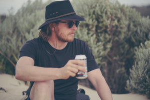
Meet Tim Kerr, our very own Brandmaster Flash. Tim is the brains (and brawn) behind the brand at Beerfarm as well as the artist behind most of our designs and illustrations. He’s been working with us since 2016 when we originally noticed his designs getting about the WA market and since then we’ve never really looked back.
Tim hasn't always been a working artist, though. From lifeguarding, architectural drafting and even geology, he's worn a few hats to say the least; but his love for beer, nature and the South West are unconditional. Read on as Tim spills the beans about working in design, life in the South West and his concept behind our Milk Stout can design, which we've nominated for the GABS 2020 Can Design Awards. Voting closes at midnight on Friday, August 7th (AEST) so don't forget to swing us a vote if you like what you see!

How long have you been a designer at Beerfarm for?
I started working with Beerfarm as a contractor initially in April 2016 and later moved to a more permanent role. How did you become a part of the team? I got a call asking if I was keen to meet. At the scheduled time, four rather shady looking characters (Ian, George, Josh and Benny J) walked into my office. They all wanted something a little different which made it tricky initially, but we finally got our ducks in a row and created a brand that had a bit of everyone's input. After that our second meeting involved them plying my with beer and asking what I usually drank. I don’t think I passed that test...
What's your favourite thing about being a designer?
I have tried a bunch of different things before I began my career in design. From lifeguarding to geophysics. Yep, I initially trained as a Geologist and have a Masters degree in it. I love the outdoors and nature, but I didn’t dig (excuse the pun) working for Oil and Gas and Mining didn’t really attract me either. What I wanted was to work in the arts. So after several years trying out architecture and drafting, I finally followed my heart to graphic design.
I started up a little studio right here in Margaret River offering illustration, graphic design, web design and later on branding. The business grew an attracted better clients and luckily landed me a role with Beerfarm where I now work as creative director. I love testing my skills in illustration and problem solving with design. Although these days a lot of the process has moved into the digital realm, I take any chance I can to work with my hands and good old fashioned pen and paper. That said it can get a little lonely at times and I also love working with people! I’ve had some great opportunities to work alongside amazing talent from illustrators to video gurus to deliver some fantastic projects. That’s a super satisfying process!
What do you enjoy doing when you're not flat out with design work?
I have come to realise that I need nature time on a fairly regular basis. I'll take it any way I can from camping to fishing, trekking, mountain biking, heck, I even tried running once. But yes, there’s definitely a pattern of adventuring and physical exertion. I’ve been surfing since a kid and I’d have to say that it has been my main passion outside of work and family life since I caught my first wave. It’s a bit of a drug and as cliche as it sounds, you never seem to be able to get enough.
Why you chose the Milk Stout for the can design awards?
At Beerfarm we do a lot of Special Release beers and usually, let our creativity run a little wild on these. They’re super exciting and a lot of fun to work on. However, design is more than about just great illustration. It’s about answering questions and problem-solving. The beer market is super saturated these days. There are so many colours and shapes jumping off the shelves of your local bottle-o that it can be really hard to make a decision. We recently decided to move to a printed can for the Milk Stout and in doing so we wanted a design that would stand the test of time and also send a clearer message to the customer at the beer fridge.
Black and white are a favourite colour combo of mine. They’re timeless and clear and I love how we’ve started to use the gold lids and trim to place our products at the higher end of the market. The colours are clearly reflective of the product inside and to me this can design answers the brief as well as it can. It’s also a pretty damn sexy result! Overall the design is bold and uncomplicated. It is strong in its simplicity and clear in its messaging. Subtly clever, unmistakably Beerfarm.
Vote for our Milk Stout can design by clicking HERE.